Overview
Custom theme settings are specified by the theme developer in thepackage.json file at the config.custom key, and there are five types of custom theme settings available:
selectbooleancolorimagetext
package.json file, custom settings can be accessed in Handlebars templates using the @custom object.
Setting keys/names
The key given to each setting is used as the display name in Ghost Admin, and as the property name on the@custom object.
"cta_text" key is displayed to site owners as CTA Text and can be referenced in Handlebars templates using @custom.cta_text.

snake_case where each space is represented by an _.
Changing a setting’s key when releasing a new theme version is a breaking change for site owners who upgrade from an older version. The setting with the old key is removed, losing any value entered by the site owner, and a new setting with the current key is created with its default value.
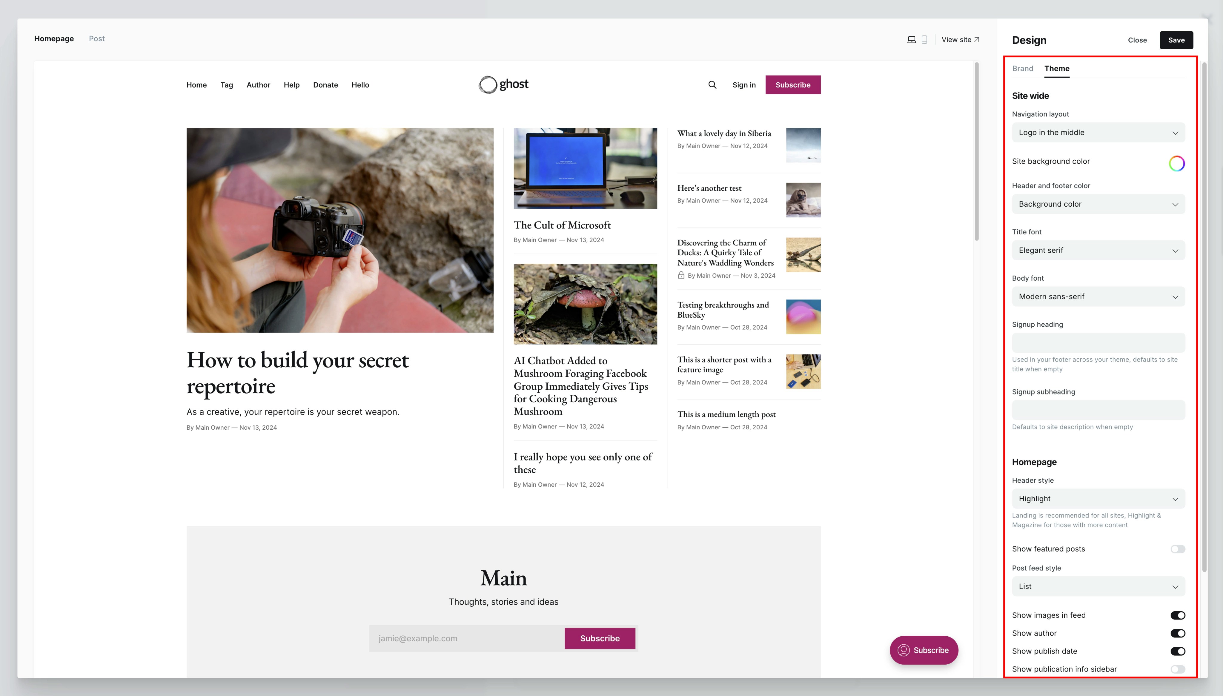
Setting groups
Theme settings fall under the Theme tab in Design & branding, and are grouped into one of three categories:- Site wide
- Homepage
- Post
"group" property with the value "homepage" or "post".
Setting a description
Give users more information about what a custom setting does by providing a short description. The description will appear along with the setting in Ghost admin. Description must be fewer than 100 characters.Setting types
Each of the five custom setting types has particular fields and requirements. All custom settings require a valid"type" — an unknown type causes a theme validation error.
Select
Presents a select input with options defined by the theme developer. Select settings are used to offer site owners multiple predefined options in combination with thematch helper:

Validation
optionsis required and must be an array of stringsdefaultis required and must match one of the defined options
Boolean
Presents a checkbox toggle.
Validation
defaultis required and must be eithertrueorfalse
{{#if}} helper:
Color
Presents a color picker.
Validation
defaultis required and must be a valid hexadecimal string
Image
Presents an image uploader. When output in themes, the value will be blank or a URL.
Validation
defaultis not allowed
{{img_url}} helper. You can pass in dynamic image sizes, if you would like to output the image in question at a resized resolution based on your theme config.
Text
Presents a text input. The value may be blank or free-form text.Validation
defaultis optional
Fallback settings
Regardless of the Ghost version, themes providing custom settings shouldn’t look broken, and should provide a fallback when necessary.Creating fallbacks for text settings
The default text for a text setting should be specified inpackage.json instead of adding it in the theme code as a fallback. This allows your theme to handle blank strings in the correct way:
{{else}} statement:
Setting visibility
Configure setting dependencies to ensure that only relevant settings are displayed to the user in Ghost Admin. For example, a theme may offer several different header styles:Landing, Highlight, Magazine, Search, Off. If that value is Landing or Search, then an additional option becomes visible in Ghost Admin that allows the use of the publication’s cover image as the background. Otherwise, the option is hidden. By configuring setting dependencies, users get a better experience by only seeing settings that are relevant.
To control when settings are visible, include the visibility key on the dependent setting. This key specifies the conditions that must be met for the setting to be displayed. Typically, you’ll specify the name of the parent setting and value it should have for the dependent setting to be visible. You can also use any NQL syntax for this — the same syntax used for filtering with the get helper.
Example: Header style and background image
In the following example, the use_publication_cover_as_background is only visible when header_style is Landing or Search. Note that when the visibility condition isn’t met, the dependent setting will render as null in the theme (i.e., @custom.use_publication_cover_as_background will be null).
show_images_in_feed setting is only visible when post_feed_style is set to List.
Setting up support for custom fonts
Custom fonts allow users to select heading and body fonts for their themes from a curated list. This provides the user with a broad range of font styles so your theme can appeal to a wider audience.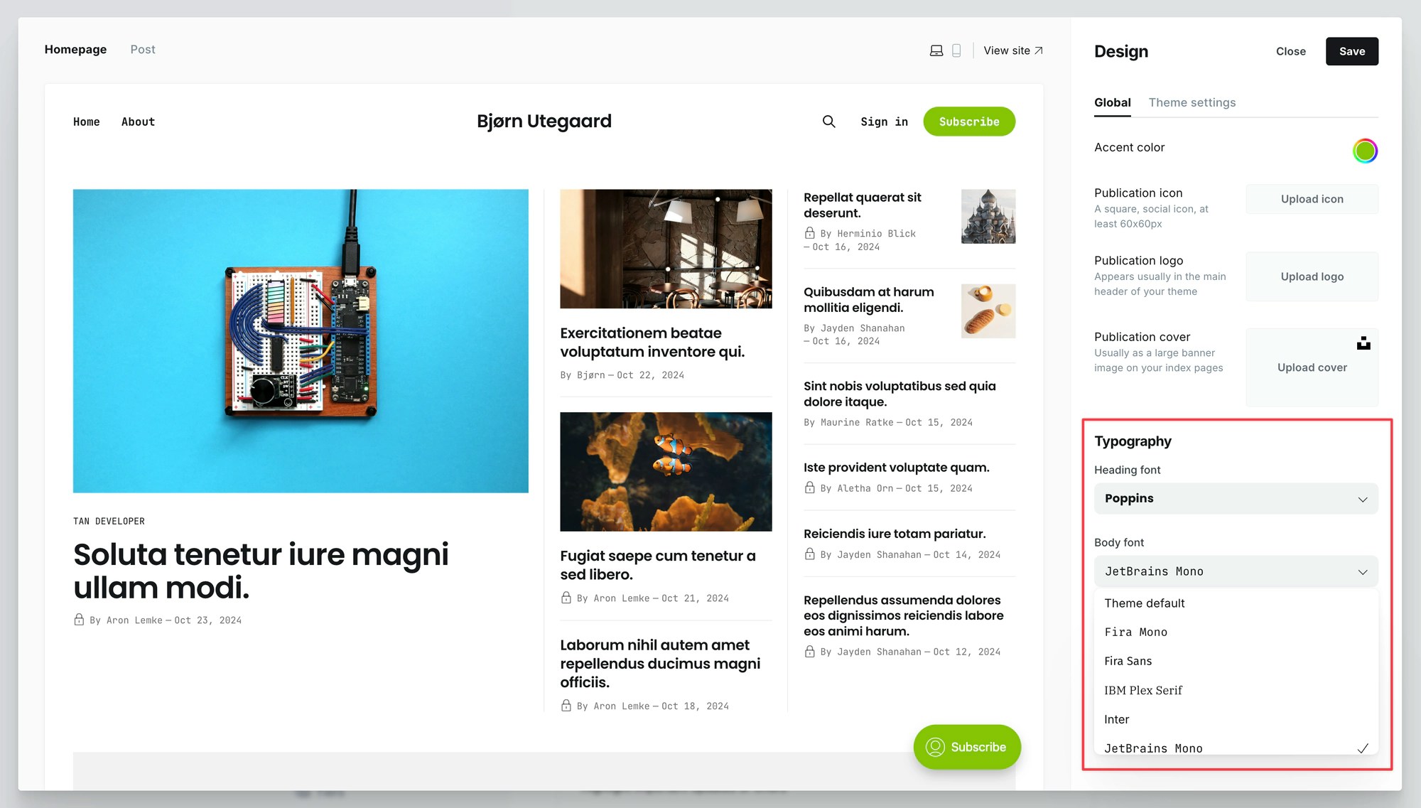
How custom fonts are loaded
When a custom font is selected, Ghost loads the font files on the front-end via{{ghost_head}} and sets up two CSS variables that reference them:
Applying custom font variables
To use custom fonts in your theme, apply the provided variables within your theme’s CSS file:{{body_class}}, allowing you to optionally fine-tune and make adjustments to any font: