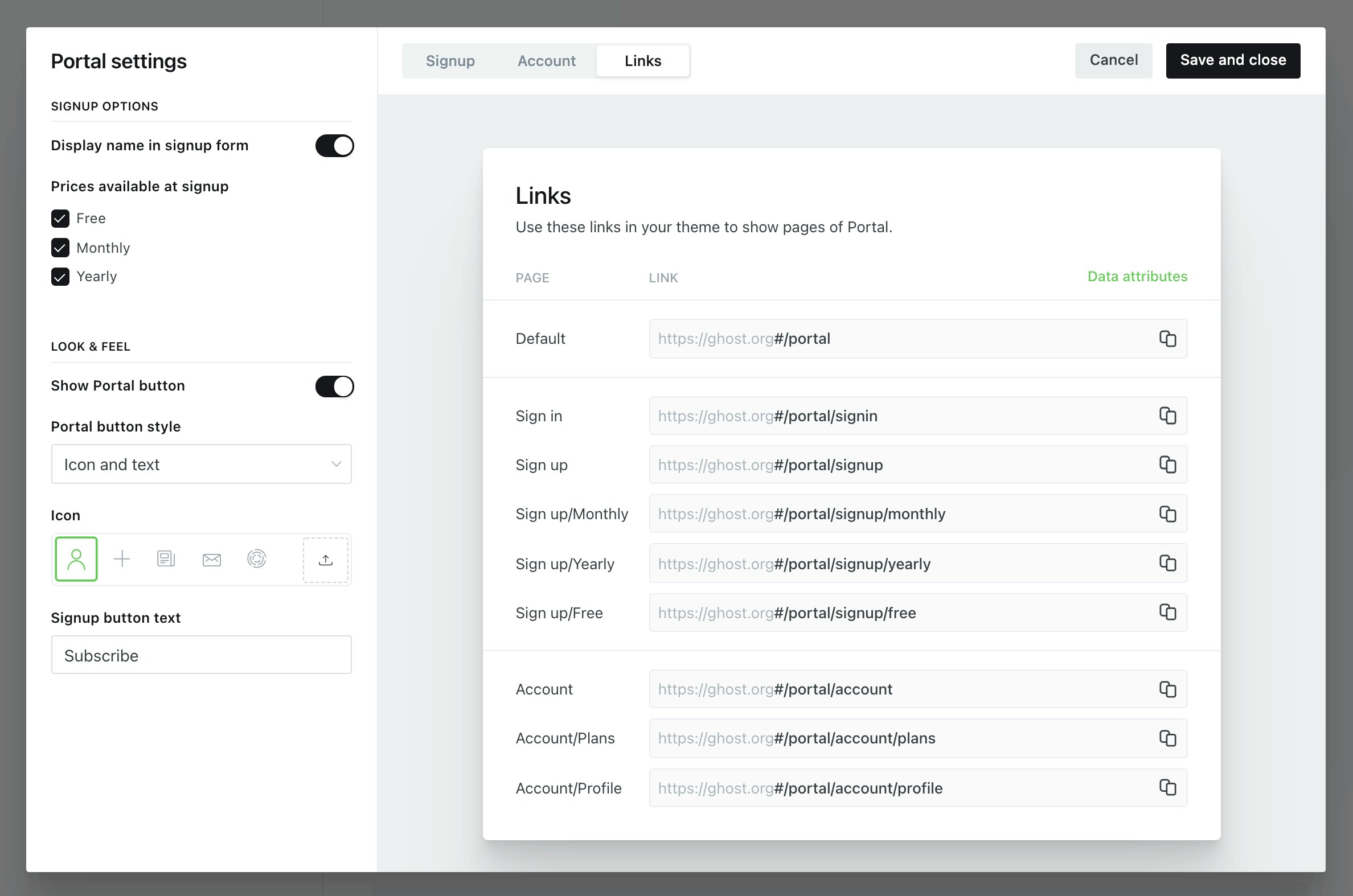
 Portal links can use absolute or relative links, for example:
```html theme={"dark"}
// Absolute URLs takes readers to the homepage and opens a Portal screen.
Subscribe
// Relative URLs open Portal on the current page.
Subscribe
```
When using the `data-portal` data attribute to control the Portal UI, additional classes `gh-portal-open` and `gh-portal-close` are added to the element to allow custom styling of open and closed states.
Alternatively, it’s possible to build entirely custom membership and signup flows directly into a theme using this guide.
***
## Signup forms
Add the `data-members-form` attribute to the form element and `data-members-email` to the email input field to create a standard email collection signup form:
```html theme={"dark"}
```
Add `data-members-name` to an input element to capture a member’s name at signup:
```html theme={"dark"}
```
Capture form errors with `data-members-error`. Errors could include too many attempts to sign up or trying to subscribe to a newsletter that no longer exists (see below):
```html theme={"dark"}
```
### Newsletter subscriptions
When a member signs up via the form, they are subscribed to the site’s default newsletter. However, it’s also possible to specify which newsletters members are subcribed to on signup by adding `data-members-newsletter` to an input element. In the example below, the member is subscribed to the Weekly Threads newsletter.
```html theme={"dark"}
```
Subscribe a member to multiple newsletters by including additional `input` elements:
```html theme={"dark"}
```
By using `hidden` inputs in the examples above, newsletter details are hidden from the user. But, you can allow users to choose which newsletters to subscribe to by using `radio` or `checkbox` elements:
```html theme={"dark"}
```
Create a dynamic signup form at the theme level by using the [`get helper`](/themes/helpers/functional/get/) to fetch a site’s `newsletters`. Then, loop through the newsletters and add the `name` property to an `input` element. See below for an example implementation:
```handlebars theme={"dark"}
```
### Apply labels from a form
Labels are useful for managing, segmenting and auditing a members list, and can be applied manually in Ghost Admin, or automatically via a form, an integration or the API.
Apply labels from a specific a signup form using a hidden HTML input element, for example:
```html theme={"dark"}
```
### Extending forms
The `data-members-form` accepts a series of optional values to customise user flows:
* `data-members-form="signin"` – sends a signin email to existing members when a valid email is entered.
* `data-members-form="signup"` – sends a signup email to new members. Uses “sign up” in email text. If a valid email is present, a signin email is sent instead.
* `data-members-form="subscribe"` – sends a subscribe email. Uses “subscription” in email text. If a valid email is present, a signin email is sent instead.
* `data-members-autoredirect="false"` - when set to `false`, the user will be redirected to the publication’s homepage when logging in. When set to `true` (the default), the user will be redirected to the page where they signed up.
### Form states
Member forms pass a series of states, which are reflected in the HTML as classes for when the submission is loading, when the submission was successful, or when there is an error.
```html theme={"dark"}
```
### Error messages
Implement error messages when a form or subscription button causes an error by adding a child element to the `
{{/if}}
```
***
## Content visibility
Control how members access content on your site, and what content they’re able to read in full as a logged in member.
### Content
All members that are logged in to your site have an access level attached to them. To correspond, all posts have a `visibility` setting attached to the `content`.
This setting is applied in the Admin UI as the [post access level](https://ghost.org/help/protected-content/) on each individual post.
### Access
`access` is a variable that calculates the access level of the member viewing the post and the access level setting applied to the post. `access` will return `true` if the member’s access matches, or exceeds, the access level of the post, and `false` if it doesn’t match.
```handlebars theme={"dark"}
{{#post}}
Portal links can use absolute or relative links, for example:
```html theme={"dark"}
// Absolute URLs takes readers to the homepage and opens a Portal screen.
Subscribe
// Relative URLs open Portal on the current page.
Subscribe
```
When using the `data-portal` data attribute to control the Portal UI, additional classes `gh-portal-open` and `gh-portal-close` are added to the element to allow custom styling of open and closed states.
Alternatively, it’s possible to build entirely custom membership and signup flows directly into a theme using this guide.
***
## Signup forms
Add the `data-members-form` attribute to the form element and `data-members-email` to the email input field to create a standard email collection signup form:
```html theme={"dark"}
```
Add `data-members-name` to an input element to capture a member’s name at signup:
```html theme={"dark"}
```
Capture form errors with `data-members-error`. Errors could include too many attempts to sign up or trying to subscribe to a newsletter that no longer exists (see below):
```html theme={"dark"}
```
### Newsletter subscriptions
When a member signs up via the form, they are subscribed to the site’s default newsletter. However, it’s also possible to specify which newsletters members are subcribed to on signup by adding `data-members-newsletter` to an input element. In the example below, the member is subscribed to the Weekly Threads newsletter.
```html theme={"dark"}
```
Subscribe a member to multiple newsletters by including additional `input` elements:
```html theme={"dark"}
```
By using `hidden` inputs in the examples above, newsletter details are hidden from the user. But, you can allow users to choose which newsletters to subscribe to by using `radio` or `checkbox` elements:
```html theme={"dark"}
```
Create a dynamic signup form at the theme level by using the [`get helper`](/themes/helpers/functional/get/) to fetch a site’s `newsletters`. Then, loop through the newsletters and add the `name` property to an `input` element. See below for an example implementation:
```handlebars theme={"dark"}
```
### Apply labels from a form
Labels are useful for managing, segmenting and auditing a members list, and can be applied manually in Ghost Admin, or automatically via a form, an integration or the API.
Apply labels from a specific a signup form using a hidden HTML input element, for example:
```html theme={"dark"}
```
### Extending forms
The `data-members-form` accepts a series of optional values to customise user flows:
* `data-members-form="signin"` – sends a signin email to existing members when a valid email is entered.
* `data-members-form="signup"` – sends a signup email to new members. Uses “sign up” in email text. If a valid email is present, a signin email is sent instead.
* `data-members-form="subscribe"` – sends a subscribe email. Uses “subscription” in email text. If a valid email is present, a signin email is sent instead.
* `data-members-autoredirect="false"` - when set to `false`, the user will be redirected to the publication’s homepage when logging in. When set to `true` (the default), the user will be redirected to the page where they signed up.
### Form states
Member forms pass a series of states, which are reflected in the HTML as classes for when the submission is loading, when the submission was successful, or when there is an error.
```html theme={"dark"}
```
### Error messages
Implement error messages when a form or subscription button causes an error by adding a child element to the `
{{/if}}
```
***
## Content visibility
Control how members access content on your site, and what content they’re able to read in full as a logged in member.
### Content
All members that are logged in to your site have an access level attached to them. To correspond, all posts have a `visibility` setting attached to the `content`.
This setting is applied in the Admin UI as the [post access level](https://ghost.org/help/protected-content/) on each individual post.
### Access
`access` is a variable that calculates the access level of the member viewing the post and the access level setting applied to the post. `access` will return `true` if the member’s access matches, or exceeds, the access level of the post, and `false` if it doesn’t match.
```handlebars theme={"dark"}
{{#post}}
Thanks for being a member...
{{else}}You need to become a member in order to read this post...
{{/if}} {{content}} {{/post}} ``` ### Default CTA With the `{{content}}` helper, visitors who don’t have access to a post (determined by the `access` property) will see a default call to action in the content area instead, prompting users to upgrade their subscription. Used in conjunction with a free public preview in post content, the CTA will be displayed after the free preview.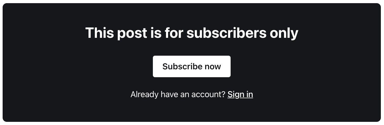 The default CTA can be overridden by providing a `./partials/content-cta.hbs` template file in your theme. The default content CTA [provided by Ghost](https://github.com/TryGhost/Ghost/blob/3d989eba2371235d41468f7699a08e46fc2b1e87/ghost/core/core/frontend/helpers/tpl/content-cta.hbs) may be used as a reference.
### The `@member` object
The `@member` object can be used to determine which content within the theme is exposed depending on the access level of the member. This is achieved using an `#if` statement:
```handlebars theme={"dark"}
{{#if @member}}
The default CTA can be overridden by providing a `./partials/content-cta.hbs` template file in your theme. The default content CTA [provided by Ghost](https://github.com/TryGhost/Ghost/blob/3d989eba2371235d41468f7699a08e46fc2b1e87/ghost/core/core/frontend/helpers/tpl/content-cta.hbs) may be used as a reference.
### The `@member` object
The `@member` object can be used to determine which content within the theme is exposed depending on the access level of the member. This is achieved using an `#if` statement:
```handlebars theme={"dark"}
{{#if @member}}
Thanks for becoming a member 🎉
{{else}}You should totally sign up... 🖋
{{/if}} ``` Using `@member.paid` allows you to expose different content to members who have an active paid subscription. ```handlebars theme={"dark"} {{#if @member.paid}}Thanks for becoming a paying member 🎉
{{/if}} ``` `@member.paid` returns `true` for members with active subscriptions in states “active”, “trialing”, “unpaid” and “past\_due”. To revoke access for members with failing payments, update your [Stripe settings](https://dashboard.stripe.com/settings/billing/automatic) to automatically cancel subscriptions after all payment attempts have failed. These two boolean values can be used together to customise UI and messages within a theme to a particular segment of your audience: ```handlebars theme={"dark"} {{#if @member.paid}}Thanks for becoming a paying member 🎉
{{else if @member}}Thanks for being a member 🙌
{{else}}You should totally sign up... 🖋
{{/if}} ``` ### Visibility The `visibility` attribute is relative to the post or page, and is useful for providing templates with extra attribute information depending on the viewer status. `visibility` has 3 possible values: `public`, `members` or `paid` . ```handlebars theme={"dark"}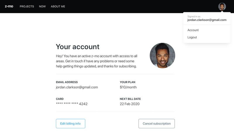 ### Member attributes
The `@member` object has a series of attributes that expose the information required to create a member profile page:
* `@member` – The member object, evaluates to `true` or `false` if the viewer is a member or not
* `@member.paid` –The member’s payment status, returns `true` or `false` if the member has an active paid subscription
* `@member.email` –The member’s email address
* `@member.name` – The member’s full name
* `@member.firstname` – The member’s first name (everything before the first whitespace character in the member’s full name)
* `@member.uuid` – A unique identifier for a member for use with analytics tracking such as Google Tag Manager
### Member subscriptions
It’s also possible to retrieve and expose information about a member’s subscription using data that comes from Stripe using `@member.subscriptions`.
Members may have multiple subscriptions, provided as an array. Subscription data can be exposed using a `#foreach`:
```handlebars theme={"dark"}
{{#foreach @member.subscriptions}}
### Member attributes
The `@member` object has a series of attributes that expose the information required to create a member profile page:
* `@member` – The member object, evaluates to `true` or `false` if the viewer is a member or not
* `@member.paid` –The member’s payment status, returns `true` or `false` if the member has an active paid subscription
* `@member.email` –The member’s email address
* `@member.name` – The member’s full name
* `@member.firstname` – The member’s first name (everything before the first whitespace character in the member’s full name)
* `@member.uuid` – A unique identifier for a member for use with analytics tracking such as Google Tag Manager
### Member subscriptions
It’s also possible to retrieve and expose information about a member’s subscription using data that comes from Stripe using `@member.subscriptions`.
Members may have multiple subscriptions, provided as an array. Subscription data can be exposed using a `#foreach`:
```handlebars theme={"dark"}
{{#foreach @member.subscriptions}}
Name: {{customer.name}}
Plan type: {{plan.nickname}}
Status: {{status}}
{{/foreach}} ``` ### Subscription attributes Subscription data comes from Stripe meaning a valid Stripe account connected to Ghost is required. Using subscription data in a local environment requires the [Stripe CLI tool](https://stripe.com/docs/stripe-cli). * `id` –The Stripe ID of the subscription * `avatar_image` — The customers avatar image, pulled in from [Gravatar](https://en.gravatar.com/). If there is not one set for their email a transparent `png` will be returned as a default * `customer.id` – The Stripe ID of the customer * `customer.name` – The name of the customer in Stripe * `customer.email` – The email of the customer in Stripe * `plan.id` – The Stripe ID of the plan * `plan.nickname` – The Stripe nickname of the plan (currently only “Monthly” or “Yearly”) * `plan.interval` – The Stripe plan payment interval (currently only “month” or “year”) * `plan.currency` –The currency code of the plan as an ISO currency code * `plan.amount` – The amount of the Stripe plan in the smallest currency denomination (e.g. USD \$5 would be “500” cents) * `status` – The status of the subscription (can be one of: “active”, “trialing”, “unpaid”, “past\_due”, “canceled”) * `start_date` – The date which the subscription was first started, can be used with the `{{date}}` helper * `default_payment_card_last4` – The last 4 digits of the card that paid the subscription * `cancel_at_period_end` – `true` if the subscription has been canceled but is still active until the end of the current billing period * `current_period_end` – The date which the subscription has been paid up until, can be used with the `{{date}}` helper * `tier.name` – The name of the tier (product) this subscription belongs to * `tier.description` – The tier's description, or `null` if not set * `next_payment` – An object describing the member's next charge, accounting for active discounts. `null` for inactive subscriptions. See [Next payment](#next-payment) below * `offer` – Details of the last offer redeemed on this subscription, or `null` * `offer_redemptions` – Array of all offers redeemed on this subscription ### Next payment Each active subscription includes a `next_payment` object that describes what the member will be charged on their next billing date. If a discount from an offer is active, the amount reflects the discounted price. **Properties:** * `next_payment.amount` – Amount after discounts, in the smallest currency unit (e.g. USD \$5 would be "500" cents) * `next_payment.original_amount` – Original amount before discounts * `next_payment.interval` – `"month"` or `"year"` * `next_payment.currency` – ISO currency code, e.g. `"USD"` * `next_payment.discount` – Active discount details, or `null` when no discount applies `next_payment` is `null` for inactive subscriptions (canceled, expired, etc.), so always guard access with `{{#if}}`: ```handlebars theme={"dark"} {{#foreach @member.subscriptions}} {{#if next_payment}}Next payment: {{price next_payment}}/{{next_payment.interval}}
{{/if}} {{/foreach}} ``` When a discount is active, `next_payment.discount` contains details about it. The `discount.end` property returns a date for both one-time and repeating discounts, and `null` for forever discounts: ```handlebars theme={"dark"} {{#foreach @member.subscriptions}} {{#if next_payment.discount}}{{price next_payment}}/{{next_payment.interval}} {{#if next_payment.discount.end}} — Ends {{date next_payment.discount.end format="D MMM YYYY"}} {{else}} — Forever {{/if}}
{{else}}{{price plan}}/{{plan.interval}}
{{/if}} {{/foreach}} ``` **Discount properties** (when `next_payment.discount` is not null): * `discount.end` – When the discount ends (date string), or `null` for forever discounts * `discount.type` – `"percent"` or `"fixed"` * `discount.amount` – The discount value (percentage, or fixed amount in smallest currency unit) * `discount.duration` – `"once"`, `"repeating"`, or `"forever"` * `discount.duration_in_months` – Number of months for repeating discounts, `null` otherwise ### Offers Each subscription exposes `offer` (details of the last offer redeemed, or `null`) and `offer_redemptions` (an array of all offers redeemed on the subscription over time). ```handlebars theme={"dark"} {{#foreach @member.subscriptions}} {{#if offer}}Signed up with: {{offer.display_title}}
{{/if}} {{/foreach}} ``` Key offer properties include `display_title`, `display_description`, `type` (`"percent"`, `"fixed"`, or `"trial"`), `amount`, `duration`, and `cadence`. ### Member account editing Members may want to update their billing information & view receipts. Rather than contacting the site owner the member can be linked to a page to access the Stripe customer billing portal with a single button: ```html theme={"dark"} Manage billing & receipts ``` An additional attribute can be used to direct the member to a different URL when they close the billing portal: ```html theme={"dark"} Manage billing & receipts ``` ### The `price` helper The `{{price}}` helper formats monetary values from their smallest denomination to a human readable denomination with currency formatting. This is best used in the context of a subscription plan to format Stripe plan amounts (see `plan.amount` above) or outputting prices for tiers. Example: ```handlebars theme={"dark"} {{price plan}} ``` This will output `$5`. The `{{price}}` helper has many options with detailed documentation [here](/themes/helpers/data/price/). ### Cancel links The `{{cancel_link}}` helper is designed to output links to cancel or continue a subscription, so that your members can manage their own subscriptions. This helper wraps all of the internals needed to cancel an active subscription or to continue the subscription if it was previously canceled. The helper must be used in the `@member.subscriptions` context, for example: ```handlebars theme={"dark"} {{#foreach @member.subscriptions}} {{cancel_link}} {{/foreach}} ``` The HTML markup generated by this code looks like this: ```html theme={"dark"} Cancel subscription ``` The `{{cancel_link}}` helper accepts a number of optional attributes: * `class` - defaults to `gh-subscription-cancel` * `errorClass` - defaults to `gh-error gh-error-subscription-cancel` * `cancelLabel` - defaults to `Cancel subscription` * `continueLabel` - defaults to `Continue subscription` Here’s an example of how you can use the helper with all of the attributes: ```handlebars theme={"dark"} {{cancel_link class="cancel-link" errorClass="cancel-error" cancelLabel="Cancel!" continueLabel="Continue!" }} ``` This would produce the following HTML for previously canceled subscription: ```html theme={"dark"} Continue! ``` Here’s an example of the `{{cancel_link}}` helper in use in the members-enabled theme [Lyra](https://github.com/TryGhost/Lyra/) within the [account.hbs](https://github.com/TryGhost/Lyra/blob/4ca9576/members/account.hbs/#L15-L65) file. It’s used inside a `{{#foreach @member.subscriptions}}` loop which provides the helper the context needed to generate an appropriate link, and is surrounded by other useful information displayed to the member. ```html theme={"dark"} {{#foreach @member.subscriptions}}Your subscription will expire on {{date current_period_end format="DD MMM YYYY"}}. If you change your mind in the mean time you can turn auto-renew back on to continue your subscription.
{{else}}Hey! You have an active {{@site.title}} account with access to all areas. Get in touch if have any problems or need some help getting things updated, and thanks for subscribing.
{{/if}}